About: The Living End
This map originally started off as an exercise in lighting. I had found that my earlier maps always suffered from poor lighting due to laziness brought on by the usage of minlight and sunlight.
Minlighting is an easy way to fill in the gaps between normal lights by simply setting any area with no lighting to a static minimum amount. This can give the illusion of radiosity lighting (or indirect illumination) without giving the washed out look that sometimes comes with using real radiosity lighting.
The unfortunate downside to this is that large areas with no lighting that at first seem fine will look flat and featureless. Lighting is a great way to add variety to your textures without actually using different textures.
The same can be said of sunlight. While sunlight isn't as bad as minlight, since it is still casting shadows from geometry in the area, it still suffers from being completely flat in open areas. Some of my early large outdoor maps like Once upon Atrocity and Dawn of Eternity suffered greatly from both of these problems.
There'd be huge open swathes of terrain and wall/floor with no lighting aside from minlight and sunlight. It's easy to disregard it at first glance because there's light on it.
Once upon Atrocity was full of areas with large open floors and completely flat and featureless lighting.
Over-reliance on minlight and sunlight can bring the appeal of a map to a screeching halt.
These areas didn't need more detail in the brushwork, they needed highlights and more varied shadows.
|
|
 |
 |
Dawn of Eternity thankfully had less of the above although it is still present.
The upper rock ledge is completely devoid of any lighting contrast. The shadow it is casting on the rock walls beneath are flat and dull and the lava doesn't even have any highlights around the edge where it meets the rocks to help smooth out the transition from gray rock to glowing lava.
|
|
 |
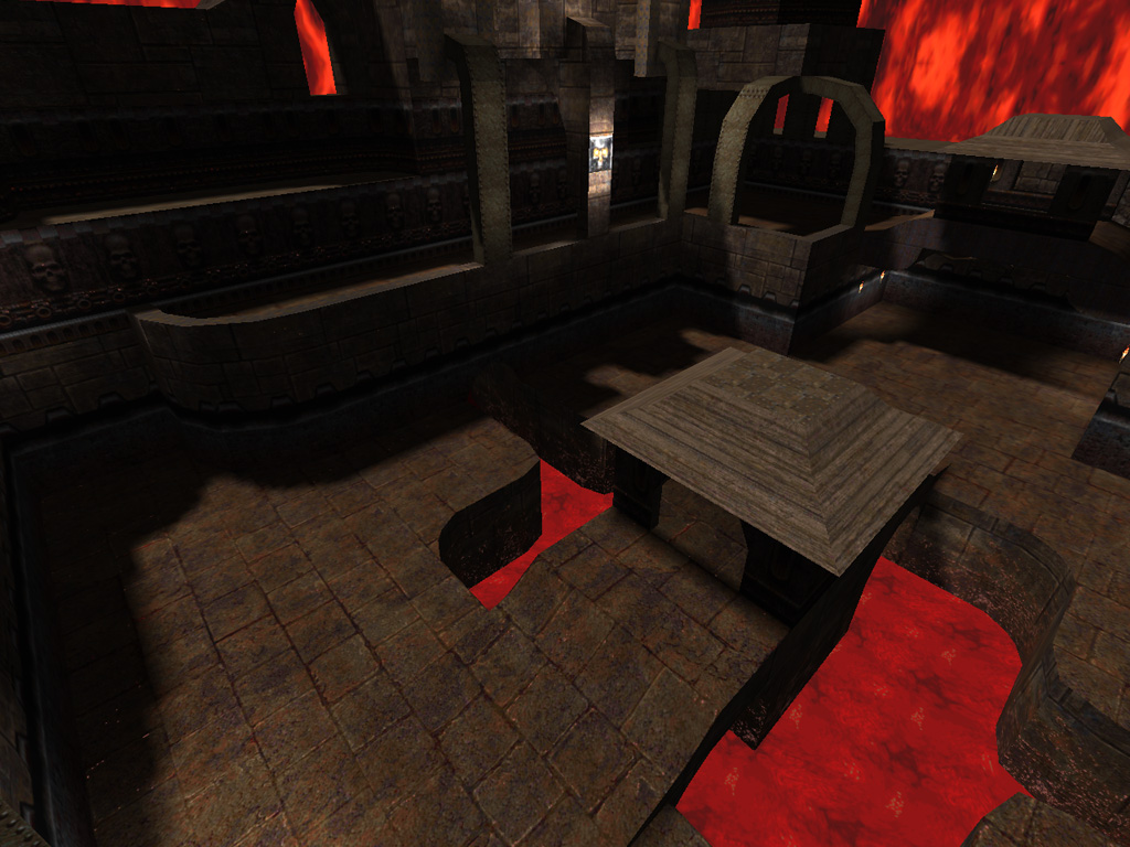
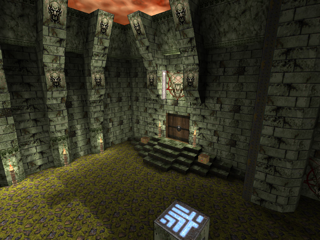
ne_lend had a minlight of 0 and 99% of the map takes place without any sunlight. This forced me to put a lot more effort into lighting than I normally would because if i didn't, areas would be pitch black which would look stupid.
I also chose to use a lot of spotlights which, until this point, I had hardly ever used before. I decided to use them all over the large flat walls surrounding the lava pit to break up the monotony of the tiling brick texture there. The result was better than I thought, because it also highlighted those areas and brought them out without having to resort to extravagant brushwork. Also, because that specific technique is consistent, it isn't a chore to see where walkable areas are. I think this helps set the scale of the cavern for the player.
Spotlights used along the sides of all the large stone brick walls.
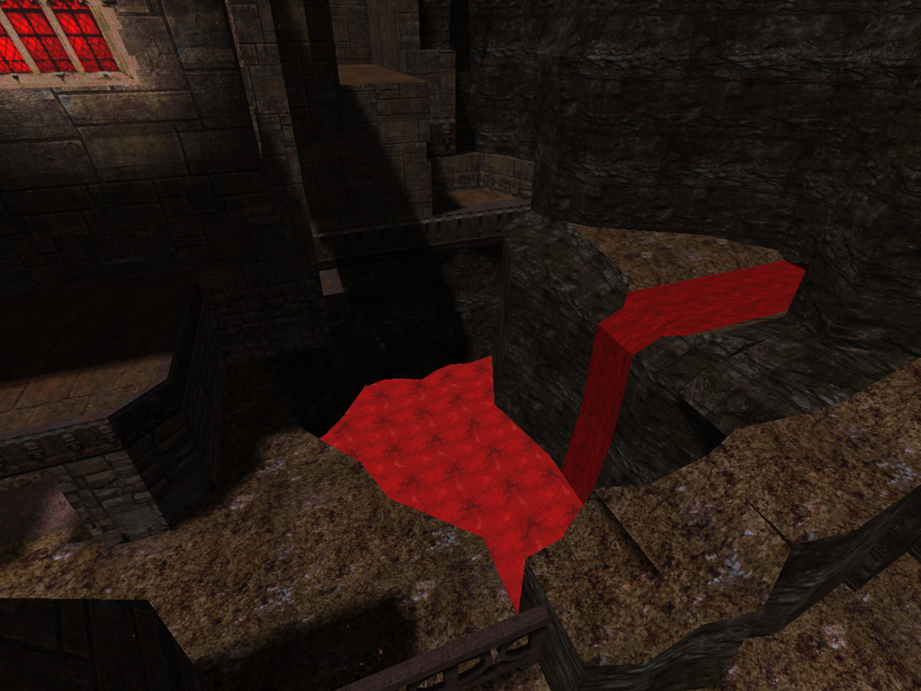
The underside of the staircase's top area (upper-right quadrant of the image) is highlighted because it is above the player's PoV when he is standing on the entrance platform.
|
|
 |
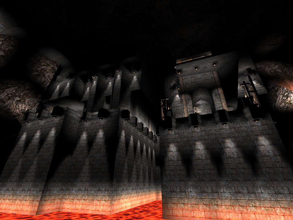
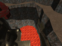
In the above image, take note of the pitch black 'ceiling'. By not lighting the roof of the cavern at all, I was able to make it look even larger than it really is, as well as save on wpoly by having a completly flat roof instead of having to do tri-souping to make it look organic.
Unfortunately, the laziness bug bit me in the end anyway. After spending all that time with spotlighting on walkable areas, I didn't have much energy left for the rest of the cavern walls. The result is some fairly boring and unintelligent point-lights scattered over the tri-souped cavern walls. (You can see a few of them in the above image in the upper-left quadrant).
What I should have done was try to simulate some real indirect lighting from the lava or at least make a nice long gradient starting at the bottom and traveling upwards.
All in all, this was a good learning experience. Maps I created after this one had markedly better lighting. ne_marb is probably the best example of that.
I kept with ignoring minlight completely and by using a lot of dim point-lights with long attenuation in outdoor areas as well as using subtle point-lights to highlight brushwork.
Dim point-lights infront of the marble faces help accentuate the extruded areas and deepen the contrast of the shadows in the recessed areas.
Dim, long attenuation lights scattered on the ground (especially in the shadowed areas cast from the sun) help keep the ground from being flat and featureless.
|
|
 |
|
One dim, low attenuation, high falloff spotlight positioned above the top step casts shadows on the step's front edge to give the look of ambient occlusion.
|
|
 |
When I started making maps for Doom3, I had to be even more cautious with my lighting, and the things I learned here helped me a lot. In a lot of ways, Doom3 lighting is inferior to old style lightmapping and properly highlighting your geometry as well as trying to simulate ambient occlusion and indirect lighting is even more important there.
|