
Category: Tronyn Reviews
Tronyn reviews: Fort Driant by JPL
- fort_driant.zip – Fort Driant by JPL
- Download: fort_driant.zip
- Download: fort_driant-fullvis.zip
Note: there are two versions of this map, a VISed version with some HOM problems and an unVISed version without those problems but which will run slowly on older systems. For further details see the readme.
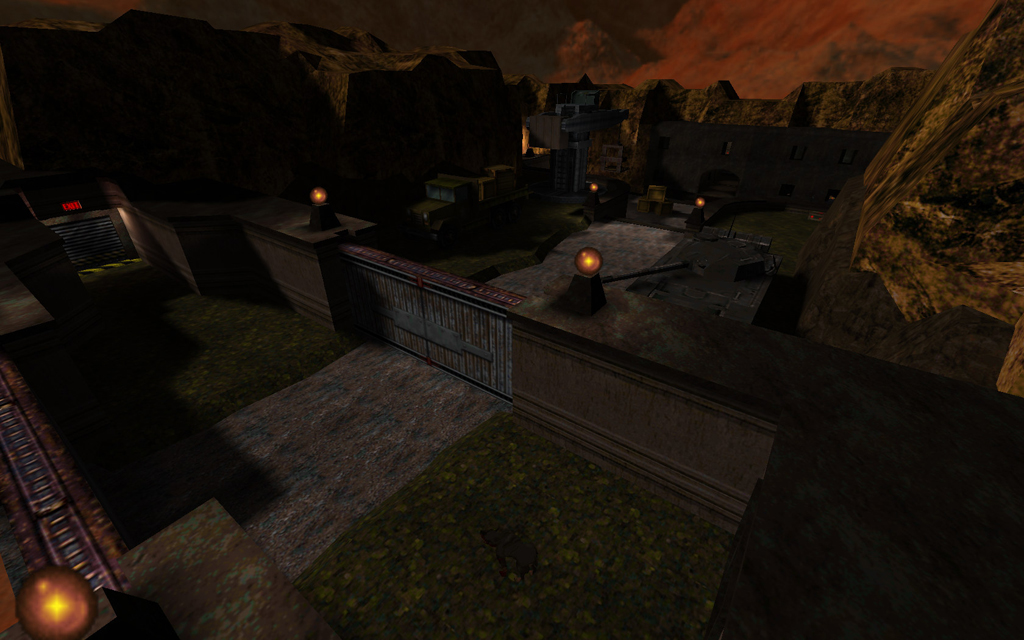
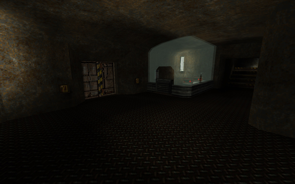
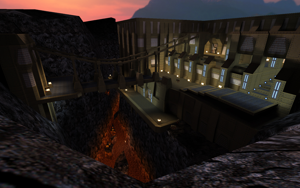
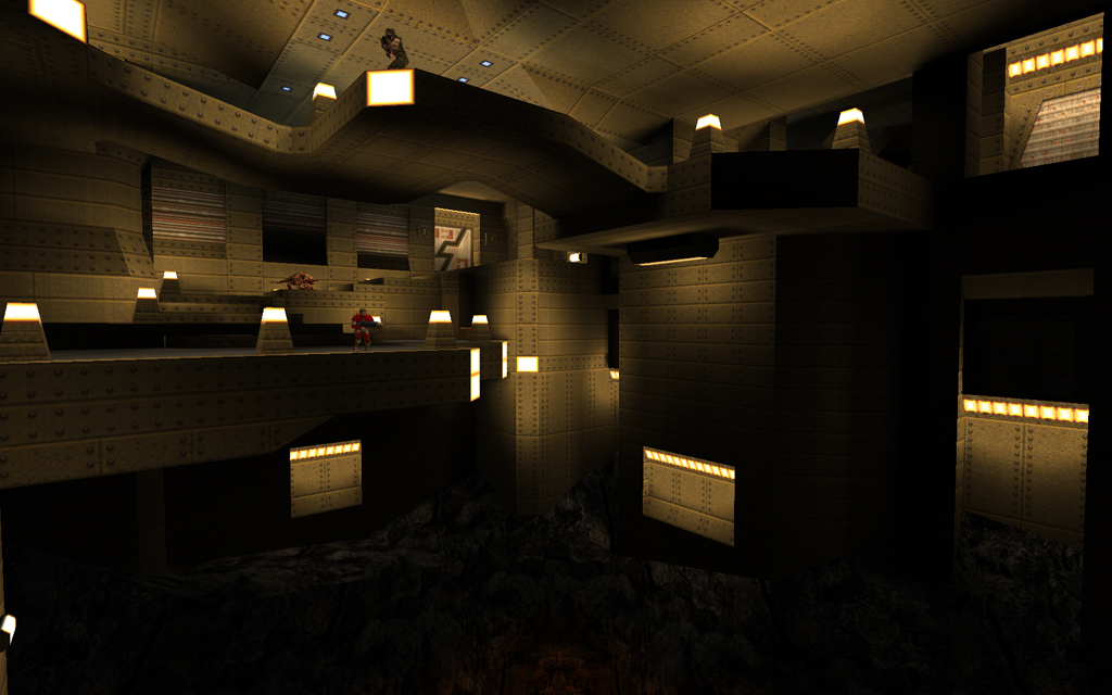
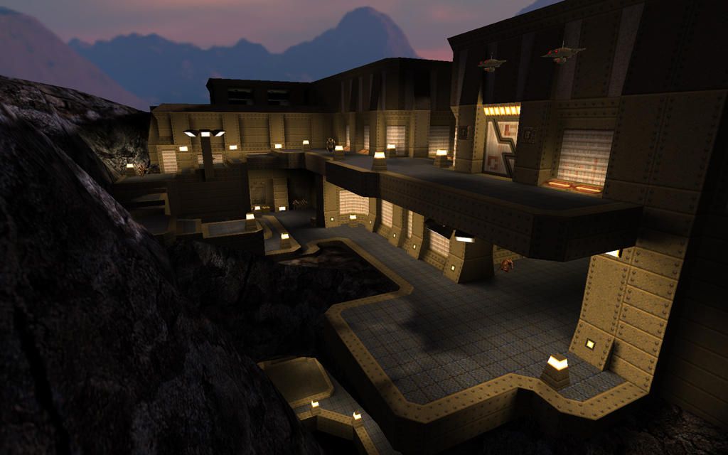
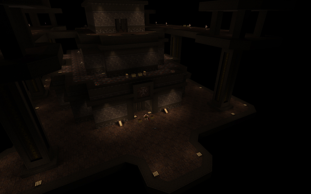
JPL’s latest long-vising handful of a map is Fort Driant, in which he brings some of the style of Half-Life (the first) to Quake. There was obviously a lot of work involved in this; the initial outdoor scene of the map is a good indication of this, as it contains replicas (brushwork, as in the original) of the trucks and forklifts from Half-Life, as well as a detailed crane with a really cool nailgun secret. The textures aren’t very Quakey, but they have converted more or less intact, and the theme of a base/bunker is pulled off well in the setpiece areas.
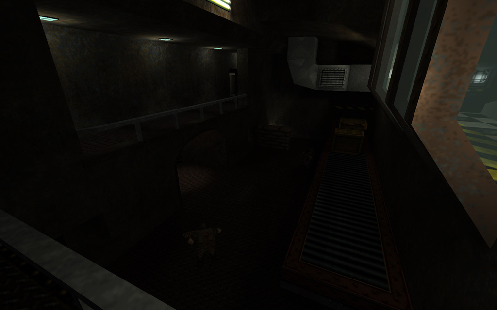
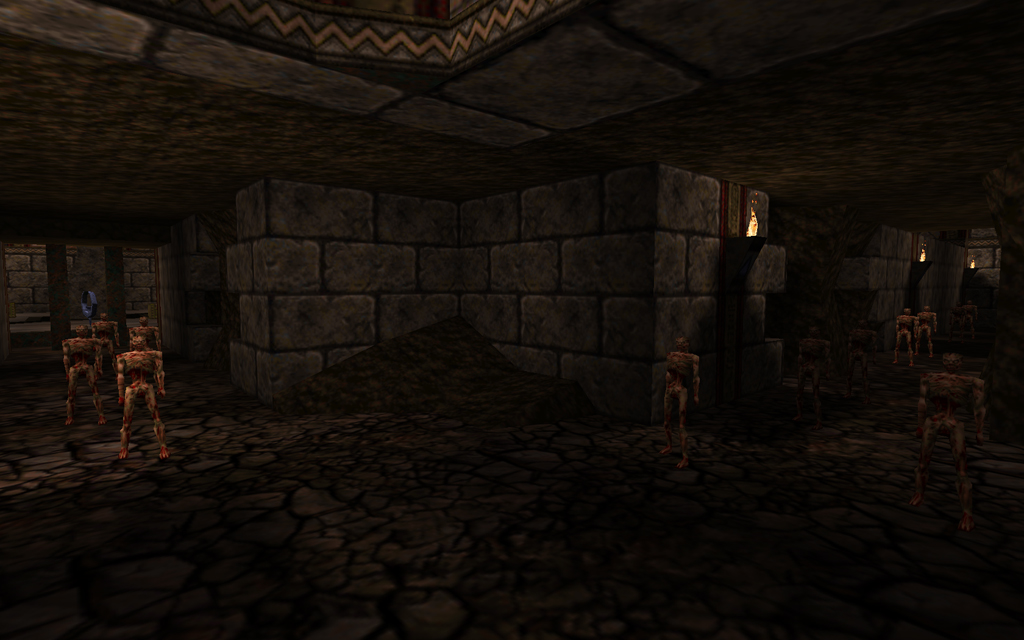
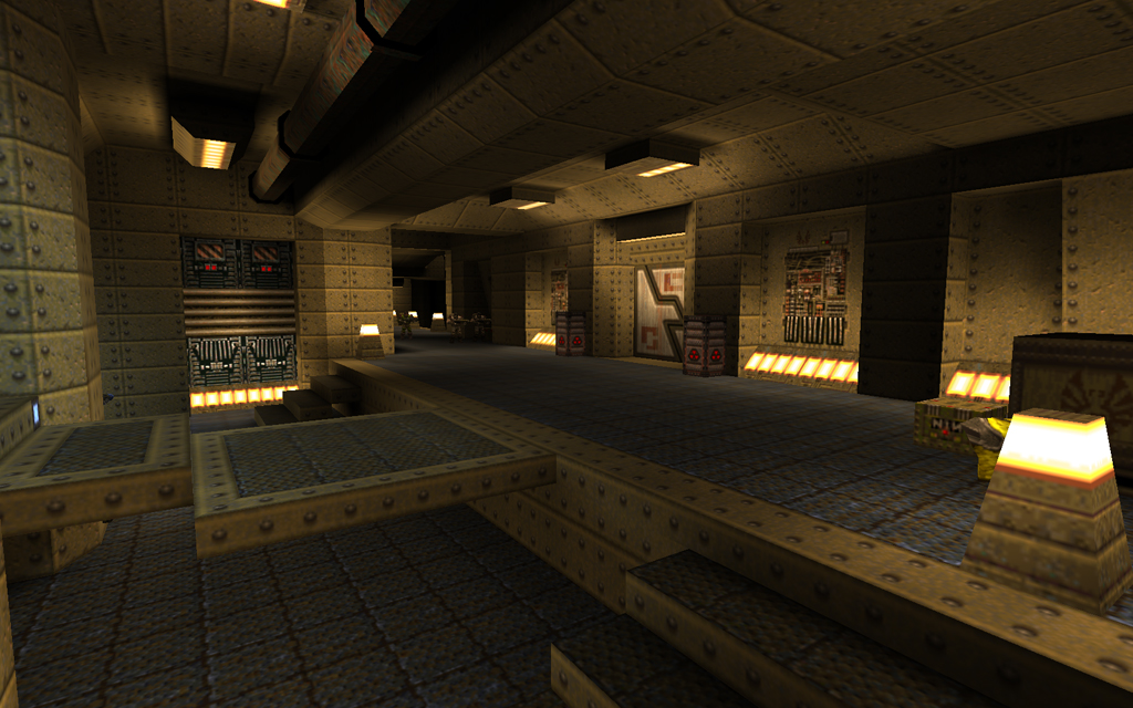
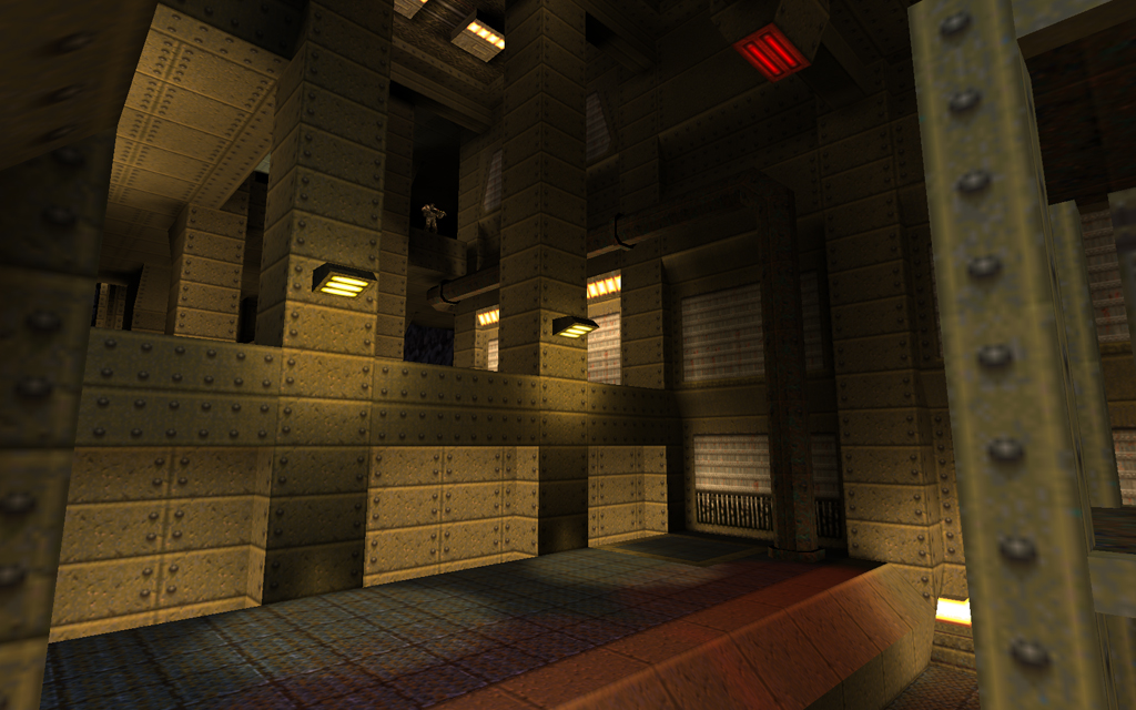
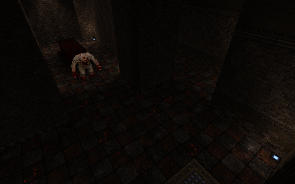
Once you get inside the base, things change a lot (and not necessarily for the better). You find yourself in fairly dark, cramped bunkers, and at the mercy of Quoth base enemies who can take shots at you through small openings in the walls. The various hallways aren’t all that distinct (a problem I had with the original Half Life), so navigation isn’t that easy although you will probably not actually get lost – the issue is more excessive backtracking to figure out where to go. Later, the hallways are better-lit, a sort of bluish futuristic appearance (functional details also make appearances in places, or as close to it as can be managed in a map this big with Quake’s block-favouring brushwork). Some of the rooms in these hallways are look decent, and the whole thing certainly is a challenge with many enemies and quite a few of those Quoth-level base foes. These things are certainly good, but there are numerous drawbacks to this style of gameplay, which by its nature (many closed corridors, where you can’t see anything but the hall you’re currently in) is confusing (no real idea of where you are relative to the layout as a whole) and frustrating (similar visuals in most places, backtracking).
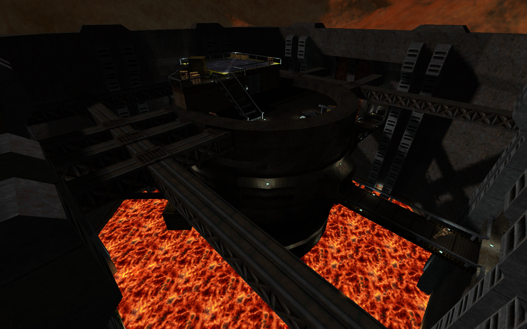
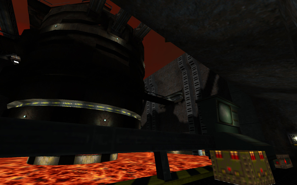
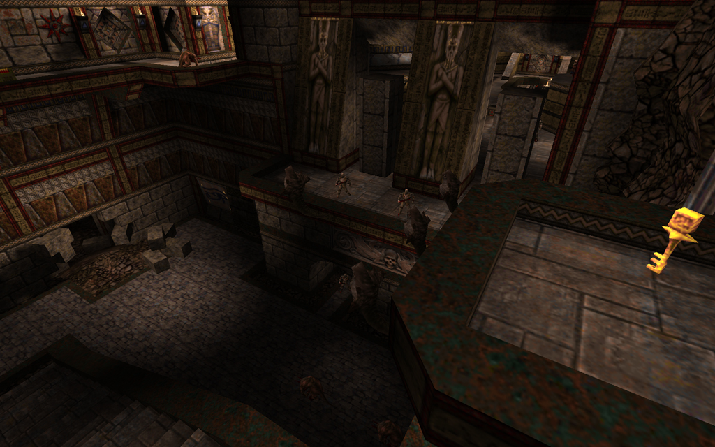
Once you reach the back of the base, the confusing corridors open up to a gigantic setpiece clearly inspired by an area early in Half-Life: a huge silo, surrounded by walkways. This area definitely looks cool, and it’s even cooler that you get to go on top of it and that numerous beams/details cast asymmetrical shadows down on the whole scene. You approach this structure from many angles, and you must beware of enemy sniping here. A lot of mileage is gained from the layout, as the exit is actually back outside the base, so you have to go through again.
This map is a mixed bag; it is ambitious, large, challenging and unique, but it can also be bland, confusing, slow, and monotonous. It seems like the amount of hallways is not really necessary, and even that the main function of the hallways area (other than imitating this aspect of Half-Life’s design) is really just to connect the two setpieces. It might have been better to split this level into two, or even three separate maps. The nature of this map means that its virtues/limitations will be appreciated differently by each player; give it a try, and see what you think.
Score: 15/20
Tronyn reviews: Temple of Anubis: Judgement of the Dead by DeathMethod
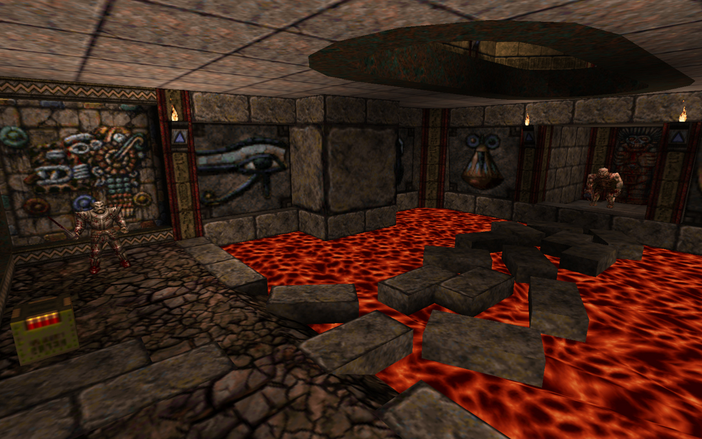
This map is a pleasingly unique Q1SP that incorporates a wide variety of textures, mainly from all four Hexen II sets. In one map, one gets a variety of colours (crimson, yellow, white, blue, green, brown), a variety of temple styles (egyptian, roman, mayan), and a variety of textures (Hexen II, Rogue, Quake, some others). While this might sound a little “busy,” the overall style is very coherent in its consistent variety. The layout could be compared to Kona‘s old maps – multileveled man-made structures built into canyon walls. There are some underground/cave/tunnel sections which are nice, including a really great one with zombies. In the courtyards, the enemy is often hell knights and ogres, though fiends and shamblers keep things edgy.
The architecture is unique and really quite detailed; the sections are distinct, and the theme is a unique take on a Quake mainstay. The map never becomes overly ambitious in size, but it provides a consistent – and a consistently interesting – challenge.
Score: 16/20
Tronyn reviews: Stark Monstrosity by RickyT23
- starkmon.zip – Stark Monstrosity by RickyT23
- Download: starkmon.zip
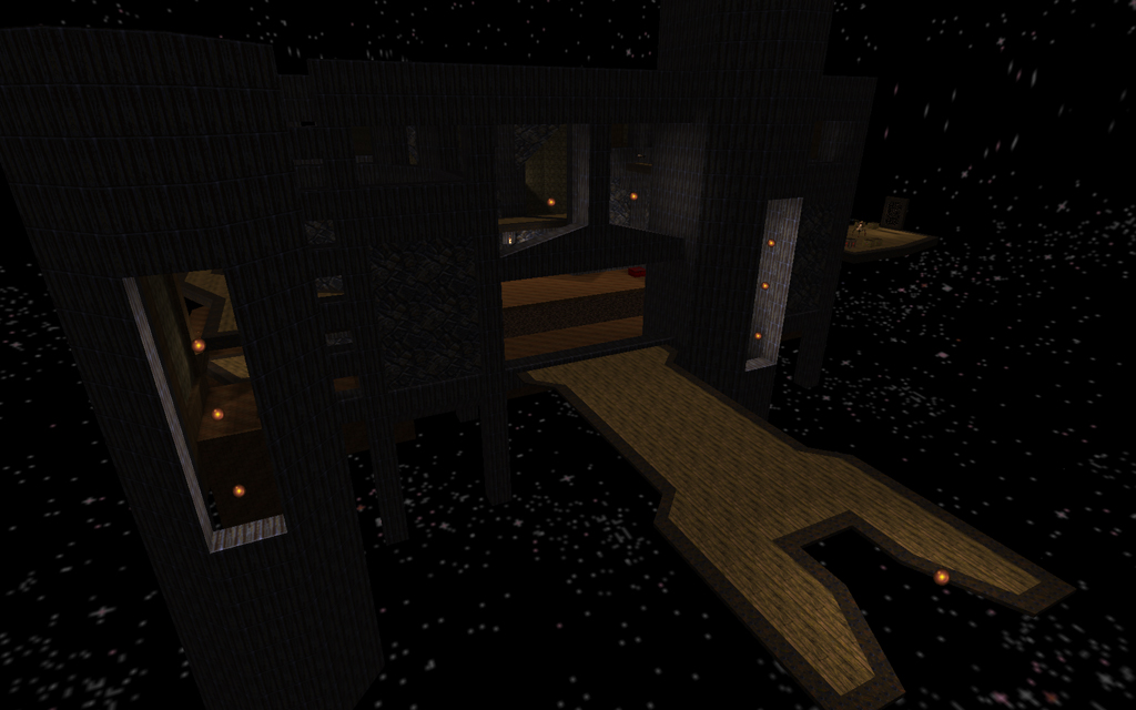
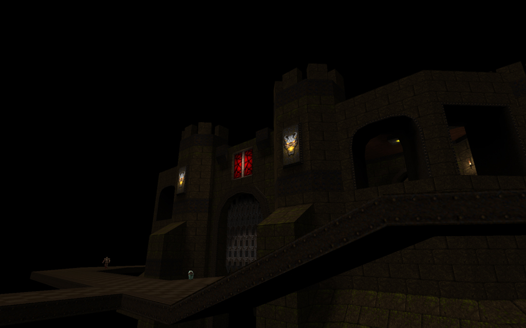
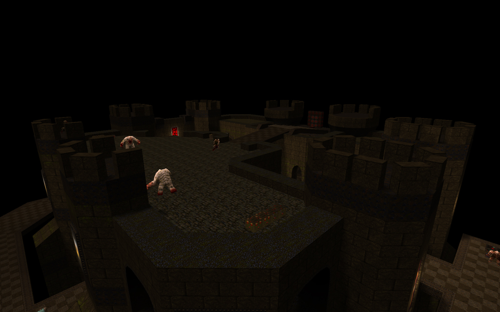
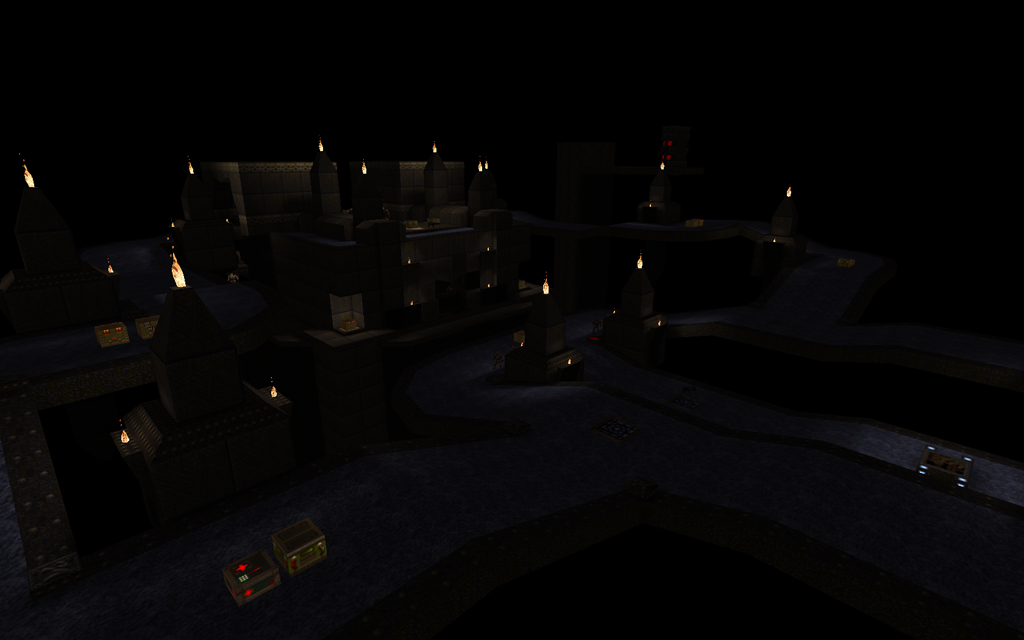
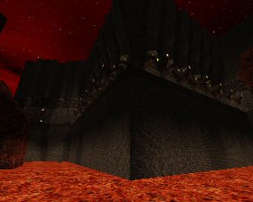
Here is an amazing new base map by RickyT23. Just when you thought idbase was dead, along comes “Stark Monstrosity,” a gigantic, Quoth-infused fortress full of many vertical levels, many enemies, and an awesomely complex layout expressed through well-built, strongly themed architecture. The lighting is also great, and the skybox is very suitable too.
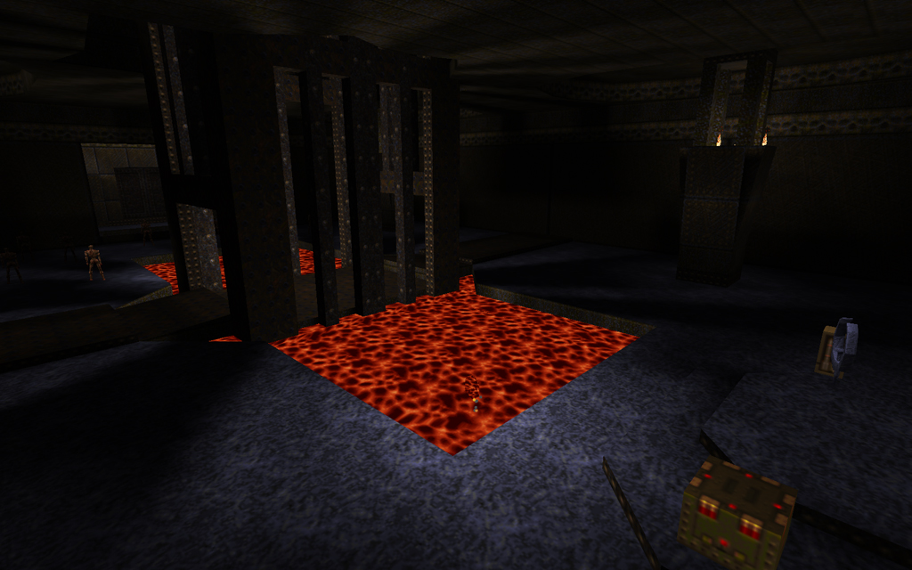
You begin at the bottom of a lava canyon, threatened by a gaunt. This section is cool, and features nice touches like glowing lava and flying lava balls. You must jump from rock to rock and avoid falling in or being killed by the gaunt – it is a nice starting challenge, not actually too hard but it keeps you on your toes. You continue through what feels like one of the largest base maps of all time, yet never slows down performance-wise (despite the open, vertical, interconnected layout) and never feels tedious because it strikes a great balance between a strong theme and visual variation. None of the areas could be confused with any other part of the map, yet all seem to fit perfectly with the map’s modified idbase theme.
The base itself is built in a large canyon/cave (nice rock architecture), and features many sections such as storage areas, stairwells, courtyards, walkways, and a suspended series of platforms reminiscent of id’s e3m1. There is also a really nice suspension bridge. Gameplay mixes in tons of Quoth enemies with regular Quake ones, of both the base and medieval varieties. There are plenty of challenging fights (varieties of enforcers are used well throughout), and higher-level enemies like Droles make appropriate appearances. I won’t give away what the ending is other than to say it is both suitable and challenging – a proper culmination what I think can appropriately be called the best idbase map in Q1SP.
Score: 19/20
Tronyn reviews: Coagula Contest 3 by ericw, gb, RickyT23, spy, Trinca, Willem and nonentity
- coagula3_pack.zip – Coagula Mappack #3 by ericw, gb, RickyT23, spy, Trinca, Willem and nonentity
- Download: coagula3_pack.zip
This is the third coagula contest (I ran the first one, UWF ran the second one), and I’ll start by saying that it is actually the best quality out of all three. There are some very nice maps in here, and a good deal of variety as well (though the futuristic style isn’t represented this time). The pack begins with a very well-made start map, coag3_start by nonentity. This map uses the texture set from Glassman’s Day of the Lords and Necros’ The Living End, so it is in very good company. It is very well-built, with lots of abnormal shapes making up some asymmetrical ruins. The purely black void (no skybox), cracked/decaying structures, and atmospheric lighting contribute to an enjoyable suggestion of mystery. Each of the levels can be reached by a portal somewherein these ruins.
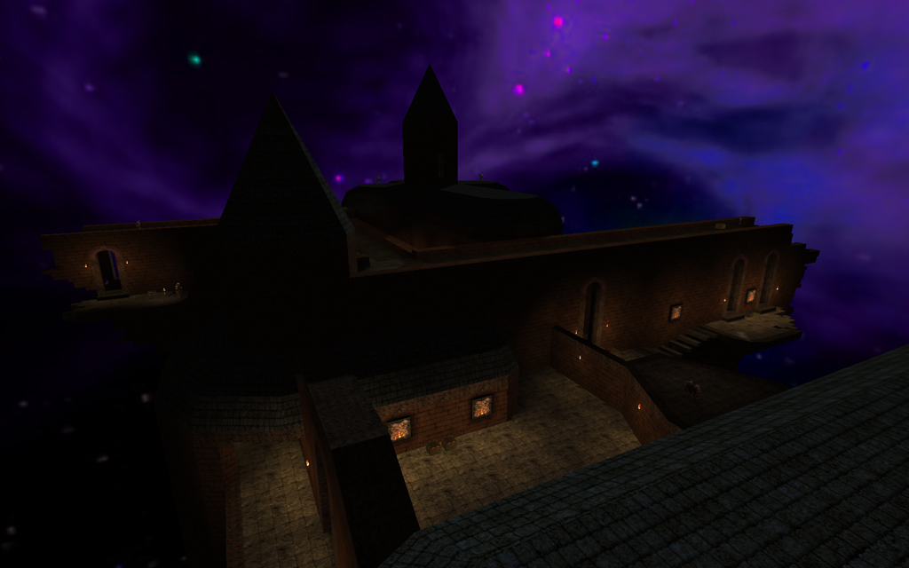
coag3_ericw
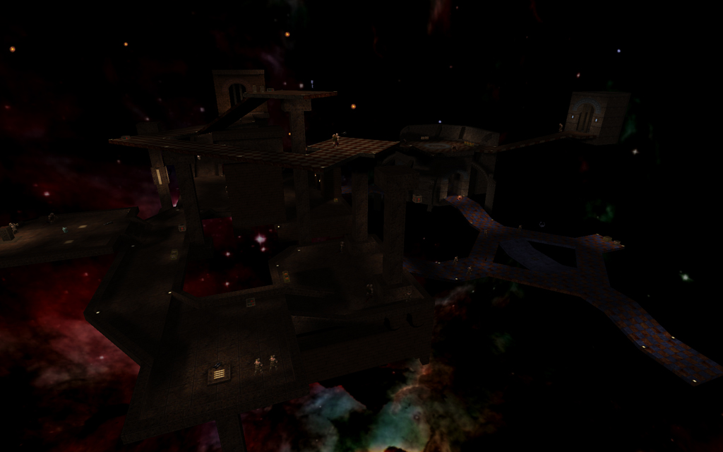
This map, Kadath, is a sort of spidery gothic structure suspended in space. There are a lot of walkways, some towers, and cool structures like flying butresses. The skybox is especially nice, epic views of colourful cosmic stars and formations. The combination of the the gothic architecture (quoth textures) with the coagula style and space sky is unique and pleasing; the map is just plain cool. Combat is logical and not overly difficult, although there is a part where shamblers hunt you down that may cause unwary players to die. The openness of the layout is exploited well to produce an interesting challenge. Overall, a very nice map.
Score: 16.5/20
coag3_gb
This is a sort of remake of id’s episode two piece, The Ebon Fortress. Whereas that level took place in a moldy ancient castle in a swamp, this new version consists mostly of disconnected architecture from the original in a space setting. I don’t think this is all that effective, as id’s architecture is very simple by today’s standards, and it looks even more bare when stripped of the sky, water, and rocks that formed its backdrop, not to mention the ceilings/indoor areas as well that provided a little more detail. The map is far too plain aesthetically. The moving platform section I think is still in there, which is kind of interesting in a void setting (I’m surprised more coagula maps haven’t used it). Mostly, however, you’re just blowing away ogres and scrags, or being frustrated by vores. No offense to the author but surrounded by the other maps in this pack, this map doesn’t look like much.
Score: 12/20
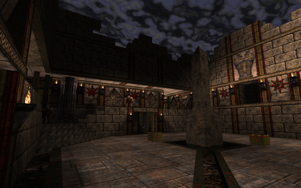
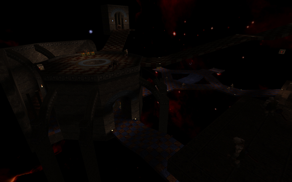
coag3_ricky
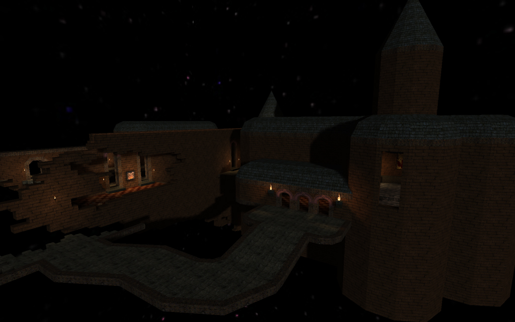
RickyT23′s map is a really cool church structure clad in Kell/other textures. The overall impression is a strong theme of red bricks, yellow wood, and white stone. There are cool details like a chandelier and some missing bricks/broken wall. The architecture is highlighted against a distinct purple skybox. what is even better than the visuals however, is the layout. The layout is logical and progressive, and the interior of the church is a suitable showdown area. After this you get to go on the church’s curving rooftops – very cool. Lots of medieval monsters are used – scrags prove tricky in a certain spot, and lots of hellknights are present to harass the player as he moves. Excellent stuff.
Score: 17.5/20
coag3_spy
Spy’s map is a green/brown E1-style castle in space (think The Necropolis, or The Grisly Grotto). The architecture is a little more basic, but this is a stylistic choice rather than a technical limitation. Angles are well used, the map has a very “solid” feeling to it as opposed to the more abstract disregard for gravity on display in, say, ericw’s map. The layout is somewhat nonlinear, meaning you get to run around killing monsters and discovering where to go without being put “on rails.” The level is fairly short, and the end is really hard, but overall just about everyone should enjoy this map – an old theme in a new style.
Score: 16/20
coag3_trinca
This map is a square arena/structure in space, using quoth textures. It’s symmetrical and nonlinear, but not nonlinear in a pleasing way (where the player is given options for routes) but instead the player will just have monsters from whatever symmetrical side he didn’t take chasing him. It’s a good blast-fest if that’s what you’re looking for, but the swarms of monsters are kind of predictable. Visually, some spotlighting and texture stacking saves the map from blandness, but detailing (perhaps windows, gargoyles, torchstands, etc) is lacking. when you get to the top level things become even more challenging; this is a good map to run through for a challenge, but not really one to savour.
Score: 14/20
coag3_willem
Willem’s map is very original runic/metal/blue thing. It’s kind of remniscent of some of Necros’ stuff, or even a really old map whose name I forget by LTH. These are only vague comparisons, however; the map definitely has its own vibe. The architecture is well-scaled, well-judged, and properly detailed. The layout is partially symmetrical but not overly so, nor is it overly linear. Each section is presented to the player logically, and is distinct without either deviating too much from the basic theme, or overstaying its own stylistic welcome. Much of the visual interest is achieved by the use of the ever-cool runic textures over unexpected or unusual angles. The monsters are what you’d expect, knights ogres and scrags, but there are some cool fiend ambushes and a few places where you are attacked from unexpected directions. Lighting throughout is great; I’m becoming quite impressed with Willem, who consistently produces stuff that is simultaneously very grounded in “Quake tradition” (such as it is) and quite unique.
Score: 17/20
Overall, this pack says very good things about the state of Quake level design at the moment, as it embodies the peak of a tradition that’s been going for pretty much the entirety of modern Q1SP (2002-onward). Though there are a couple weaker maps, they’re worth playing and the best maps in this pack can accurately be described as exquisite. The virtues of this form, and of map packs like this generally, are that you as a player get a good deal of variety and nothing that demands an epic commitment. Here you’re on tour through various hostile realms of space. Enjoy the ride.
Overall Pack Score: 18/20
Tronyn reviews: Are You Yet Living? by Necros
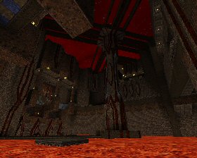
Another strange and hellish map from Necros, this perhaps might have been a “b-side” from the “The Living End/Elder World Waystation” which got my vote for best release of the year (along with my own masterpiece of course). The architecture is similar to those maps: large, squarish areas built of different layers/levels of blocks, with large spikes and beams (and spiky beams) lending an ominous and abstract ambience. This, however, is in the more orthodox Contract Revoked textures, although it doesn’t use bookshelves really except in one area, which is unique for this texture set. Mostly, this is a lava-dungeon, again comparable to “The Living End,” although not quite on the same scale.
Quoth enemies are used, as well as plenty of bombardment from distant ogres and scrags. There is one cool and evil ambush, and scrags are used throughout, inhabiting the map’s gigantic open spaces. The same principle gets even more intense when the Quoth super-tarbaby (I know that’s not what it’s called…) – the green one that can turn invisible – joins in the fun.
While Necros’ other maps from this year undoubtedly overshadow this map, it is nevertheless a welcome opportunity to traverse the disturbing and surreal world of Necros. Don’t miss it.
Overall Score: 16.5/20
« Previous Entries Next Entries » Easily install and launch Quake maps with the cross-platform