 Tweet
Tweet
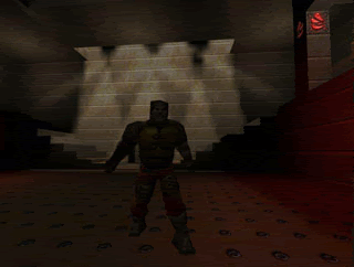
Purple? The chest armor is pink-ish. I sampled the colors from the original and used those as a base for the new skin's colors. I'm not going to limit myself to the quake's palette when I have 16 million colors to choose from . To me, the armor needs to look like metal, that's all. Also, I ran it through Lightning_Hunter (he seems to be my main tester-feedback source) and it seemed to be fine, but I can always make a new one using different colors.
People, don't forget the alternative Grunt skins, also made by Fragger:
http://www.quaketastic.com/upload/fi...Alt_Grunts.zip
On the topic of the Knight's mouth - I thought it looked ok in the game. The open mouth might only slightly resemble a smile when looked at in certain screenshots.
When I playtest skins, I try to take the middle position on everything. If I were to be TOO picky, then nothing would ever get done, and I'm sure there would be some frustration. Fragger already made 4-5 versions of the Knight face as it is, and I felt this one was the best. I'm sure he can make an alternate version further down the road, but at this point I'm very satisfied with the version he made. Fragger has many more skins to do, so I try to point out the "glaring" issues with each one so he can move on. There is no point spending weeks on the same part of one skin when the general consensus is that it looks great. Believe me, it's hard to get approval with faithful remakes. I've been part of many communities that have re-made old games, so I see this all the time.
I'm planning to do new skins with different themes after I'm done with this set, so nothing's final or set in stone.


Comment