If this is your first visit, be sure to
check out the FAQ by clicking the
link above. You may have to register
before you can post: click the register link above to proceed. To start viewing messages,
select the forum that you want to visit from the selection below.
Actually I was just visualizing a low on health scheme.
It would be sweet if the music stopped... the gunshots and everything were short but more pronounced, and faded out quickly like BLAaaa-am sort of echoey like shot in a hallway (tunnel vision for the ears). The scene could get much sharper and in focus (more saturated?) and there could be a slight bob. So its kind of like your heart stopped and you're keenly aware of everything...the player will know right away that they are almost dead.
I am pretty sure there are games that do this.
Its like the heart beat thing, minus the annoying heart beat and pulsing red screen and bloodshot overlay.
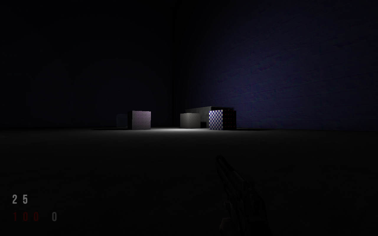
I already have something like this for my WIP ChipQuake. If health goes beyond 80, the screen fills with a red fog, and health starts regenerating slowly, until it reaches 80. Also, there is a screeching sound. You just gave me the idea of combining desaturation with red fog. I think it would look awesome.
I also agree with some other opinions around here, and ChipQuake has only a number for the ammo, and a number for health. The player learns immediately which is which.
I am concentrating on singleplayer, story and atmosphere. Remember Call of Cthulhu, the game? That game really scared me! It had a very nice atmosphere. Scary, noir, immersive. That's what I'm aiming for. Oh, and simplicity. No bulkiness, bloatness and overuse of graphics.
Sorry to say that but it looks like crap, even original Quake hud is way nicer.
Im familiar with Your projects, they are nicer then Your HUD
@HUD_WAR:
Baker, there's no way im going to finish my hud design by Friday im leaving for a few days so don't hurry with Your proquake stuff
Btw, do You have idea how to deal with resolution issue? Scaling down is a resource whore so we can forget this one. Rescaling hud to full hd from 1024x768 isn't a good idea for modern hud, various gfx versions for each res would be nice option i guess. Or maybe You got other idea how to resolve this matter.
Sorry to say that but it looks like crap, even original Quake hud is way nicer.
Im familiar with Your projects, they are nicer then Your HUD
Eh? Well I for sure don't like Chip's color choices with the HUD but to each their own.
By the way to anyone who does know: Chip saved the Quake community from the PlanetQuake meltdown --- I know most ppl don't know who Chip is ... PlanetQuake Archives | QuakeWiki
@HUD_WAR:
Baker, there's no way im going to finish my hud design by Friday im leaving for a few days so don't hurry with Your proquake stuff
Extra time = good.
Btw, do You have idea how to deal with resolution issue? Scaling down is a resource whore so we can forget this one. Rescaling hud to full hd from 1024x768 isn't a good idea for modern hud, various gfx versions for each res would be nice option i guess. Or maybe You got other idea how to resolve this matter.
Pretend it isn't an issue for right now ... most engines resize graphics very poorly. I've been thinking about this for a LONG time.
One way or another, this issue will eventually die.
I'm not ready to concentrate on the engine coding for that kind of thing just yet, but it'll get addressed. Probably what an engine needs to do is re-read the 2D graphics and resample them whenever a video mode switch or the 2D width is changed.
Eventually I'll conduct experiments ...
Quakeone.com - Being exactly one-half good and one-half evil has advantages. When a portal opens to the antimatter universe, my opposite is just me with a goatee.
So while you guys all have to fight your anti-matter counterparts, me and my evil twin will be drinking a beer laughing at you guys ...
@Baker: Colours are temporary. I just wanted an uncluttered HUD. The numbers will be transparent and will match the game theme, be it blue or green or white.
@Dissaster: Some of that text will dissapear - like the developer stuff - some of it will become slimmer and moved down and to the left a bit. Thanks anyway for liking my projects
@Chip: The only issue with your HUD is colors. Blue sticks out like a sore thumb next to white and red. Light gray would probably go better in its place.
Likewise, it would be more intuitive to have health be red and ammo/armor be white. After all, health is associated with blood. What better way to communicate health than through blood red numbers?
A rule of thumb is that you should never use perfectly stark colors. By that, I mean you shouldn't have, for example:
1. White (255 255 255). It's too distracting unless everything else is starkly colored.
2. Red (255 0 0), Green (0 255 0), and Blue (0 0 255). Looks like highlighter colors on your screen. None of them mix well with pretty much anything.
3. Black (0 0 0). Perfect black shows up a lot in games. Thus, it's better to choose something a bit lighter than black (very dark gray, maybe) so what could be important text doesn't end up blending into the background.
Remember that you can have something that is noticeable without it constantly catching your peripheral vision.
Don't forget to do me a personalized hud with a big ass radar on it. Don't give it out to wolv this time tho
Originally posted by Baker
Why does the biggest cry baby in the forums use an Arnold Schwarzenegger avatar? Arnold never cries like a little girl like how you have cried in every Kimp thread.
don't forget to do me a personalized hud with a big ass radar on it. Don't give it out to wolv this time tho
:d
Quakeone.com - Being exactly one-half good and one-half evil has advantages. When a portal opens to the antimatter universe, my opposite is just me with a goatee.
So while you guys all have to fight your anti-matter counterparts, me and my evil twin will be drinking a beer laughing at you guys ...
Thanks for your opinions. There is a slight possibility of choosing a light yellow, #FFFFCC or #FFFF33, as it might fit my noir, desaturated game theme.
Looks great, chip. I only repeat the opinion already stated. The red health is a little hard to see, like the opacity is too low. Otherwise it looks fantastic. Just more proof in the pile that numbers are still king.
 Tweet
Tweet


Comment