-
-
Personally, I'm not a fan of putting HUD elements around the crosshair at all. Expect maybe a simple (small) number that tells me my health. I'm pretty sure there are guidelines for HUD design out there somewhere, because this is totally not the first time that people try to design a HUD. I would guess some multi million dollar company already put a lot of research into this.
It's highly likely there is a reason why the HUD in most modern FPS looks like it does - usually numbers at the bottom of the screen, and perhaps ammo count on the weapon (which is logical).
A variation is to have a bar for the health (and maybe armour), as has been suggested already. Health bars are usually at the top of the screen in some bright colour.
Some of you guys have designed pretty abstract HUDs, like "lobes around a circle" and stuff like that. And while it looks good on paper, consider why no other fast FPS (Warsow, QuakeLive, Unreal Tournament) has this style of HUD.
Abstraction is too much for most players. If they need to learn what the HUD elements mean, that's the opposite of user friendliness. Numbers at the bottom are battle-tested and found working.
For available weapons and ammo, QW people often use a list down the side of the viewport. This way, they're out of the way but also quick to find.
It seems like you're trying to reinvent the wheel, which I think is counterproductive and user-unfriendly. the barrier to entry must be as low as possible. Use the lowest common denominator if you want people to play it.

This is what the HUD looks like in Warsow - not unlike Quakeworld. It's not fancy at all - but it works (TM).
You should also include a few different HUD configurations and let the user pick which one he likes best.Comment
-
I agree with everything you said, but most of all with this. Even though it's not fancy, it still does look nice, and it works perfectly well. Something like this would be ideal.Originally posted by golden_boy View PostsigpicComment
-

Sticking to the tried and true is a safe bet for a company spending $$$ on game dev. We are just kickn free ideas around. Doesnt hurt. Heck, we may stumble on something others are afraid to test. Though, my current hud config looks much like Warsow's layout, right down to the transparent sbar. If its a matter of texture replacements, there's http://gfx.quakeworld.nu/browse/hud/ as a place for inspiration.Last edited by R00k; 08-09-2010, 06:48 PM.Comment
-
I understand, but I'm afraid where human interface design is concerned, certain things are tried and true.Comment
-
I haven't played HL2 for a while, but I don't remember being annoyed by the bars around the crosshair. Actually, I got used to it very fast. But I agree the goo old HUD shall be an option anyway.Originally posted by Skutarth View PostComment
-
A great looking HUD is good marketing. People like teh shiny.Originally posted by golden_boy View Post
Plus it is good engine development fun.
And players like options. Hence, the GFX Quakeworld.nu site with 75 different replacements for numbers.
Tried and true way, for sure. But there are plenty of reasons to do HUD experimentation. One reason ... no one has done it in Quake.Quakeone.com - Being exactly one-half good and one-half evil has advantages. When a portal opens to the antimatter universe, my opposite is just me with a goatee.
So while you guys all have to fight your anti-matter counterparts, me and my evil twin will be drinking a beer laughing at you guys ...Comment
-
okay, so...
show_healthbar {0/1}
show_healthbar_x horizontal positioning
show_healthbar_y vertical positioning
show_armorbar {0/1} show_armorbar_x, show_armorbar_y
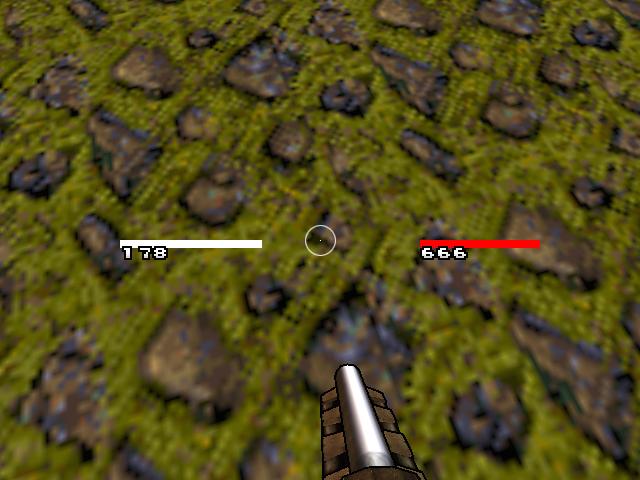
These are 640x480 screenshots (for forum posts), so the bars look bulky but at native res they are less. Plus the alpha of the bar is based on value/max_value.
Oh and the color of the armor bar is based on what type of armor you have
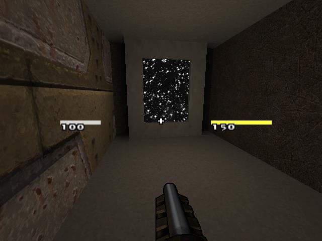
edit: here's a better ss
 Last edited by R00k; 08-09-2010, 09:56 PM.
Comment
-
When Quake was released nobody though about playing fps with mouse, recently nobody thought that playing FPS on multitouch enabled device is possible and even if it is that it would be a mess ...Originally posted by golden_boy View Post
Gates said that 256 kb ram will be sufficient for everybody, always ...
I got something sleek and sweet almost ready at home - like i said before its pretty much classic design but i want to focus on sfx related to player status rather then bars and values - a more natural reception of information
Comment
-
This GPL sound archive has great heartbeat sounds
http://tenshihan.nexuizninjaz.com/FO...0Soundbank.zip
It also happens to have great footstep sounds.
Examples:
HeartBeatLoop(Fear).wav
HeartBeatLoop(Norm).wav
HeartBeatLoop(Peaceful).wav
/It's actually 640K, not 256! But yeah, that's a hilarious historical quote for sure. Arguments against experimentation are almost by definition invalid.
And I mean this with all due respect to Warsow, but their HUD looks like shit. I considered a more refined word than "shit" but the word is a good descriptor.
Anyways ....
Inkscape ( http://inkscape.org/ ) is an open source 2D vector graphics maker so anyone can use it.
I have no artistic talents but I could probably make a couple of HUD prototypes that are kind of Quake 4 or Half-Life 2ish. Those are just shapes and alpha and Inkscape is well suited for such a task.
This would be just to put forth some more ideas in the thread, like I said I have little to no artistic talent.Last edited by Baker; 08-10-2010, 02:11 AM.Quakeone.com - Being exactly one-half good and one-half evil has advantages. When a portal opens to the antimatter universe, my opposite is just me with a goatee.
So while you guys all have to fight your anti-matter counterparts, me and my evil twin will be drinking a beer laughing at you guys ...Comment
-
I've always found that interface is designed for the smallest learning curve, but if you set the curve just a touch higher, something you have to internalize just a bit more, it ends up more intuitive and you spend less time deciphering the damned thing once you're used to it.I understand, but I'm afraid where human interface design is concerned, certain things are tried and true.
UI should get out of the way once you know its there, instead of getting in the way the more used to it you are.
As far as tried and true, I think its more like tried and works good enough for us to not bother with anything else.Comment
-
-
@bFeared
Your 2nd one is exactly what i wanted in the 1st place might be tricky ingame but cool as an optional hud, i like the concept over-all i would use it for sure. Unfortunatly as we pointed in this topic before this one isn't good for 90% people out there.Comment
-
There doesn't have to be just one HUD, but I really like bfeared approach.
This is just me playing around with Inkscape.

I was emulating the graphics seen in Half Life 2 and Quake 4 HUDs, which have an alpha component.Quakeone.com - Being exactly one-half good and one-half evil has advantages. When a portal opens to the antimatter universe, my opposite is just me with a goatee.
So while you guys all have to fight your anti-matter counterparts, me and my evil twin will be drinking a beer laughing at you guys ...Comment
-
Experimenting is all good, but golden_boy has a point. If this GPL pak1 is supposed to be used in multiplayer (and here I mean QW, I don't have any experience in NQ multiplayer) a classic HUD is mandatory. People are used to numbers and they will want the numbers regardless of how unimaginative or outdated they might look. So to release this client it has to contain a classic HUD, and everything else is optional.Originally posted by golden_boy View Post
Also, heartbeats, blur, blood stains and cracks on the screen are great stuff to set up the atmosphere for singleplayer. But they're likely to be turned off in multiplayer. Look, I'm not trying to discourage anyone to implement his or her ideas, I'm just not sure if this is the right time to do it. I mean, this project is already huge if only focused in replacing id copyrighted content, let it alone adding stuff.
Anyway, I'm not linked to this project, so do as you please.Comment
 Tweet
Tweet

Comment